Tag Archives: What I Like

Second Life Photos: What I Like #16

I have fallen behind and it’s been weeks since I posted What I Like. Just to catch up a bit, I am going to post short explanations and more pictures.

Degas'd

Degas’d by Grazia Horwitz.

I like Degas’d by Grazia Horowitz. Why? The desaturated subtlety gives it an air of fragility that suits the tentative pose, the cocked shoulder, inward-turning feet, the air of uncertainty and delicacy.

Hands Away . Andrews Asthetic (pv 1)

Hands Away . Andrews Asthetic (pv 1) by ROQUAI Poses

I like Hands Away by ROQUAI Poses. It is intriguing and prompts questions. It makes me want to know more. It’s bold and dares to withhold. Continue reading

Second Life Photos: What I Like #15

A Short Film About Long Things

A Short Film About Long Things by Whiskey Monday

I like A Short Film About Long Things by Whiskey Monday. It defies gravity and our expectations. I also think it sold more HPMD grass than all their marketing combined. It’s a play on perspective challenging our expectations which is what art should do. Ernst Gombrich said, “Art is an institution to which we turn when we want to feel a shock of surprise. We feel this want because we sense that it is good for us once in a while to receive a healthy jolt. Otherwise we would so easily get stuck in a rut and could no longer adapt to the new demands that life is apt to make on us. The biological function of art, in other words, is that of a rehearsal, a training in mental gymnastics which increases our tolerance of the unexpected.”

Well, that’s what Whiskey is doing, increasing our tolerance of the unexpected. In terms of composition, you can see the light pole follows the Rule of Fifths, the line from Whiskey to the bird and the edge of the grass follows the Rule of Thirds, and the subject follows the Golden Ratio.

When I was six years old I broke my leg. I was running from my brother and his friends. Tasted the sweet perfume of the mountain grass as I rolled down. I know I've grown... I can't wait to go home.

When I Was Six Years Old by Chel Glitter.

I like When I Was Six Years Old by Chel Glitter. Here is a delightful story-telling photo from Chel Glitter. I enjoy her photostream for all the stories she gives us in story. This one just made me grin…but you should click through for the whole story.

Continue reading

Second Life Art & Photos: What I Like #14

"Smoke on the water, a fire in the sky"

Smoke on the Water Fire in the Air by Shyralei.

I like Smoke on the Water Fire in the Air by Shyralei. The only bold colors are the red of her eyes and lips, everything else is blacks and grays with a hint of blue that adds a chill. The smoke adds an aura of mystery. There are the 45° black lines which are called sinister diagonals because they create a sense of foreboding, of loss. it’s an emotionally evocative picture.

Take Me Somewhere Nice by Mr. Munro

I like Take Me Somewhere Nice by Mr. Munro. It’s a great example of how window lighting can add emotional impact to a photo. The composition is good. Following the rule of thirds, the couple is placed so they are centered on a vertical line one-third from the right. As much of her is to the right of that line as he is to the left. Her head is one-third from the top and the tabletop he rests his head on is one third from the bottom. Continue reading

Second Life Photos: What I Like #13

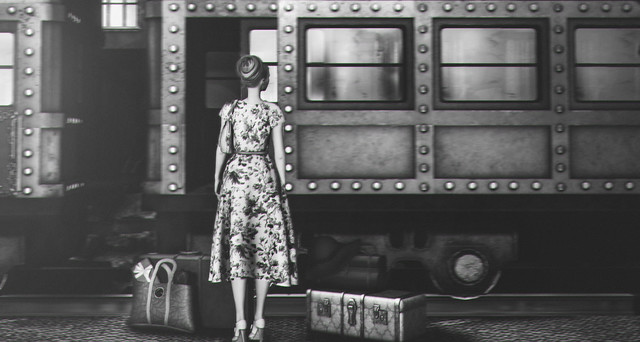
Station Approach Station Approach by Lily Lovelace.

I like Station Approach by Lily Lovelace. This seems like beginning of one of those old black and white movies. Everything is of that time and place, the vintage cut of the dress, the floral fabric, the stack heels, her hair style, the suitcases, and the train. Black and white only adds to that vintage feeling. Do you think she might be going home for a holiday? The floral dress suggest happy anticipation. There’s a present tucked into her tote, the only modern looking element. Of course, if it were a movie, someone would disappear from the train and she would solve the murder before arrival…without even mussing her hair. Meanwhile, the composition places her exactly by the rule of fifths. The bottom of the train car is also two-fifths from the bottom, a sort of horizon. Continue reading

Second Life Photos: What I Like #12

Feed Your Creativity

Feed Your Creativity by Jewel Appletor aka Karalyn Hubbard

I like Feed Your Creativity by Jewel Appletor aka Karalyn Hubbard. Do I even have to say why? Her entire stream is filled with similar work, bringing together elements of Second Life® in shots that look like illustrations, but actually have very little post-processing.. While the subject is centered, it is not symmetrical, the flowers are in the lower left and upper right, framing her face. I just love everything about this picture. However, picking just one item from her stream was difficult. Her newest picture of birds is darling.

Oɴ Tᴏᴇs

I like On Toes by Tank Jarrod Holden.

I like On Toes by Tank Jarrod Holden. When I came across this photostream last night, he had only 109 followers. How can this be? His entire stream is filled with extraordinary landscapes. I probably should have chosen one of the landscapes, but this whimsically romantic picture just appealed to me.  It is simple, but effectively creates a mood and tells a story. The light from behind helps create another plane, the people in the foreground, the mid ground, and the background outside Continue reading

Second Life Photos: What I Like #11

Gelato by Michelle Halster

I like Gelato by Michelle Halster. The ice cream cone is placed according to the Rule of Fifths and it is a focal point in this photo, however, its real intensity comes from the eye contact between the two of them, the way they hold each other’s hands. That sense of being in a world of their own is accentuated by the sky forming an arc around them.

<3 by ♥Talija♥.

I like <3 by ♥Talija♥. First I love forsythia, so this immediately drew my eye. I love the way she uses the flowers to make a frame within the frame, encircling her face.  Continue reading

Second Life Photos: What I Like #10

Out on the edge .. ♪ ♫

Out on the Edge by Isabella.N.

I like Out on the Edge by Isabella.N. even though it gives me an uncomfortable reminder of when I fell off a cliff overlooking the Missouri River. Lucky for me, the face was perpendicular so I bounced a few times on the way down, slowing the momentum. Bad memories aside, this photo evokes other emotions as well, the exhilaration of challenging yourself, of being ahead and apart from the madding crowd, of being out on the edge. It is also a beautiful example of the Golden Ratio at work.

I'm sorry

I’m Sorry by Marion Beresford

I like I’m Sorry by Marion Beresford. I like the bright light and the subsequent contrast between the brightness of the right that blows out the background and the shadow on the right that her hair fades into. However what I like most of all is the emotions projected by her eyes, the tilt of her head, the furrowed brows. I like this avatar’s face. Continue reading

What I Like #9

2017.0404 by Irukia Levee

2017.0404 by Irukia Levee

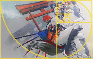
I like 2017.0404 by Iruki Levee. Her control of color caught my eye first.  There is the desaturated skin and background in shades of gray that make the bold reds, yellows, and blues pop. Then there is the beautiful free-form setting as though she is resting in a cloud, though clouds don’t show shadows (I’ve tried.) Then, the composition fully embraces the Fibonacci Spiral. It all comes together in an amazingly powerful photo.
Continue reading

What I Like #8

wandering_world484

Wandering World 484 by Nekonuko.

I like Wandering World 484 by Nekonuko. The bottom of the windows fall exactly 2/5ths from the bottom, but the real magic in this picture is its impressionist painterly feeling created with an overlay that adds texture as well as making the lighting more complex and richer. The color story is beautiful, too, with the yellows to balance the blues.

Untitled

Untitled by Kiiko.

I like Untitled by Kiiko. I love the interplay of shadow and light. The Rules of Thirds is used in bounding the dark right edge and the placement of the subject. The green and red are complementary colors. It’s well-composed in framing, color, and lighting.
Continue reading

What I Like #7

earth

Earth by Kate Bergdorf

I like Earth by Kate Bergdorf. I love the lighting, even though the sun is not directly visible, we can feel its heat and brilliance in the way it sets the grass alight. I have mentioned before that we unconsciously look for and identify geometric shapes. This beautiful landscape is filled with geometry and that gives it balance and makes our lizard brains happy. Whether Kate Bergdorf deliberately set out to capture all these shapes or whether her innate instinctual search for patterns guided her lens, I do not know. It still works.
Continue reading