Those of us who have installed Second Life viewer updates recently have all had a moment when we said “Gack! Where’s my windlight? What have they done!!!” Actually, I am sure most of us had more profane things to say as we struggled to understand this new interface. My first reaction was totally negative. I have found a couple silver linings, though, to the grey cloud that is the new interface and struggled through. I am sure that other folks who are also exploring the new interface has even more ideas of how to use it more easily and hope everyone can share their tips, because the new interface has confounded some folks. As I get more comfortable with it, there are some things I value.
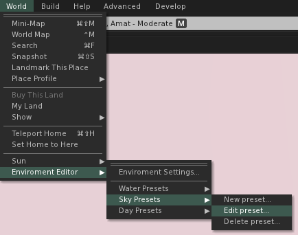
The Environment Editor is in the same place as ever, though we have faster access to the different components of the editor than before. They have also given us some additional day presets so we can choose our Second Life environment and still have it cycle through day and night. This will be a great benefit to role-playing sims and other sims that want a day and night cycle, but want a different environment than the default we are all used to.
Ambitious people can create their own Day Cycle or Fixed Sky settings and make them the default for their region, giving people a much stronger level of control over how people experience their sims. We used to get notecards at a sim with a suggested windlight setting we could replicate if we weren’t too lazy. Then we could get notecards in some viewers that we could click on to import a setting or get a link to a preset we could download and install, if we weren’t too lazy. Now, all we have to do is got there and unless we override the region’s lighting with our own, we will see what they want us to see. That’s a bonus.
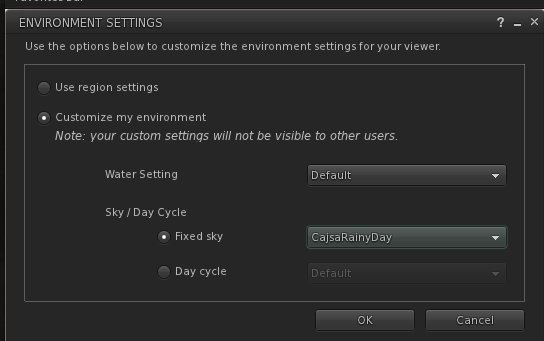
In Environment Settings, you can select your Water Settings, your Day Cycle or decide to have a Fixed Sky. Those of us who used a work-around to fix the sky with windlight settings of our choice will be happy to know that whatever Fixed Sky setting is selected will be saved until you decide to change it yourself, so no more fiddling with the sky settings during each log in and no more having to delete your day cycle settings to work around that. This is a huge benefit, in my opinion, that offsets to some degree the awkwardness of the new interface for creating and editing windlight presets.
Creating a new preset is actually easier to understand than editing a preset and you can infer how to go about it from the edit instructions. For the purpose of this tutorial, I am going to use Edit Preset and open up an already saved preset.
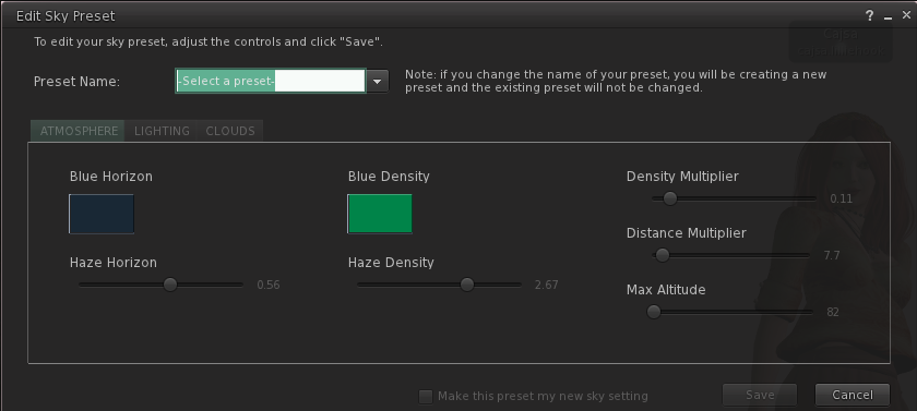
Choose the preset you want to work with from the drop down menu in the upper left. Until a preset has been chosen, you can’t do anything with the menus except admire them or stick your tongue out at them or curse them. Curse you, sliders!
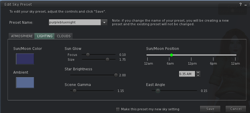
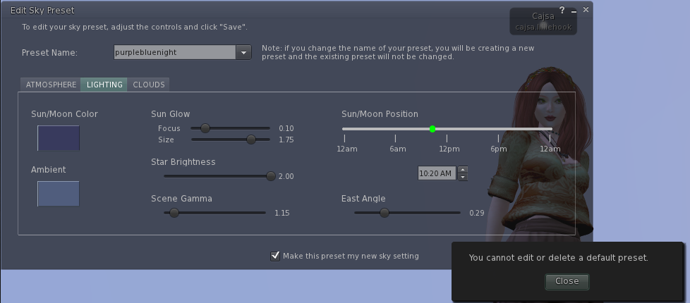
So, I chose purplebluenight and as soon as it was selected, I could fiddle with sliders and click on color selection boxes and play around.
Handy Tip #1: One thing I learned totally by accident which made Windlight so much easier for me, is that if you click on the dot on the slider, you can use the right and left arrow to move it up and down the slider with far greater precision than you can dragging it with your cursor. I am not sure if that was an Aha! moment or a Doh! moment.
Let’s look at the three tabs. The first is Atmosphere and controls the sky color and haziness. The second is Lighting and controls the angle and direction of the sun, its intensity and the overall contrast in the environment. The third tab is Clouds and controls Clouds. What did you think it controlled? You can learn the details of each of the controls here on the Second Life Wiki:
Okay, I have fiddled. My Sun/Moon Position (sun’s vertical position) has been shifted, my East Angle (sun’s horizontal position) has been shifted. I even made the ambient light a little lighter. I click on Make this preset my new sky setting because I have already learned that if I just select it and close it, the sky goes back to what it was before I chose this preset. Yeah, I didn’t like that part either. Now, this is where Second Life decides to protect us from ourselves. You see, I clicked Save and look what happened. You cannot edit or delete a default preset. This is where it’s okay to say Gack! or Arggh! or other choice words.
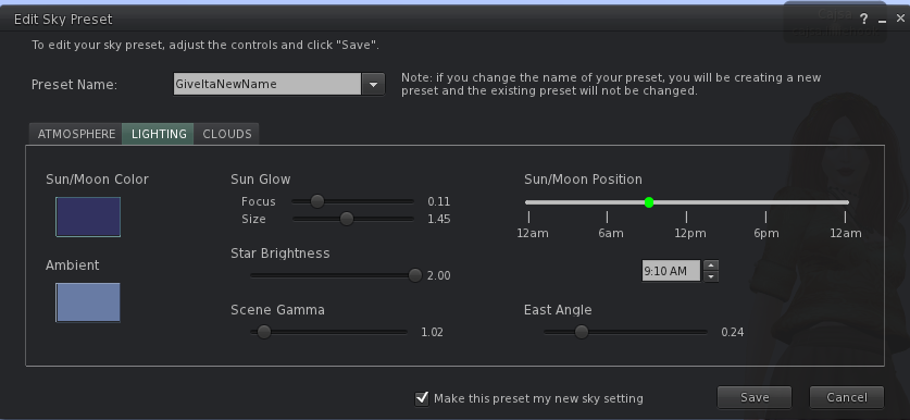
So, what do you do? You give it a new name. See, this new preset is called GiveItaNewName. I learned not to put spaces in my Windlight names because then when you share with others sometimes they get %20 instead of spaces and that’s just annoying. Now I can click and it will be the sky setting and stay that way until I change it or switch over to Day Cycle.
Handy Tip #2: If you are merely moving the sun around to suit the specific position and pose for this single picture, you don’t really want to save a new preset. But if you don’t save a new preset, the settings will disappear. The loss of ability to make temporary adjustments without creating a new preset is my biggest quibble with the new interface. However, you can minimize the Edit Preset widow without closing it and keep your skies as they are temporarily.
If you are ambitious, you can learn all about creating your own settings for your region so people see your creations as you wish them to see them right in the Knowledge Base Article on Region Environment Settings. One thing I hope to see is skin designers setting a skin optimizing setting for their region so that bloggers who use windlight don’t get IMs telling us we photoshopped the skin when all we did was use windlight to show the skin in its best light.
Last, but far from least, I am going to send you over to Strawberry Singh’s blog where she has a comprehensive listing of Windlight Preset resources for you and instructions on how to install them.


Thanks for your article, Cajsa! Other Second Life users have complained about the new Windlight Settings layout, some of them have brought up good suggestions to improve the layout; I have been gathering and organizing these ideas in the STORM-1525 bug report on JIRA (the report itself is currently closed, look in the comments)
If readers of your blog have other suggestions, I invite them to add them there. Or, feel free to add them to my SL profile feed and I’ll take care of them:
my.secondlife.com/opensource.obscure
One thing people used to the old WindLight controls might want to know as well, if they’re trying to rebuild a setting that got lost in a crash or something (as one of mine did recently): the old sliders for setting RGBI colors were on a percentage system. The new controls use standard RGB values (and forget Intensity). If you know the old settings, simply multiply 256 by that number, and that will be your correct number for Red, Green and Blue.
(Thanks to someone at Builder’s Brewery for letting me know on that one.)
Wow! What a great tip!!!!
Thanks! I do like some of the new things with the new interface – like keeping a fixed sky from log in to log in. I just wish we got all those bells and whistles without the new interface. I will definitely be checking that out.
Yeah…noticed the new windlight interface. I don’t know about everyone, but I actually used those X,Y,Blue,density sliders individually all the time….guess I’ll just have to spend some time tweaking. Thanks for the info =]
Pingback: Friends Don’t Let Friends Take Bad Snapshots « the messenger
Pingback: She can read (she’s bad) « Pleisure
Pingback: She can read (she’s bad), reboot « Pleisure
Pingback: Facelights your days are numbered. | Sookie's World
Pingback: Tips&Tricks. A post about where from and how to. And to say thank you! « Through Salamander's eyes