I like Smoke on the Water Fire in the Air by Shyralei. The only bold colors are the red of her eyes and lips, everything else is blacks and grays with a hint of blue that adds a chill. The smoke adds an aura of mystery. There are the 45° black lines which are called sinister diagonals because they create a sense of foreboding, of loss. it’s an emotionally evocative picture.
I like Take Me Somewhere Nice by Mr. Munro. It’s a great example of how window lighting can add emotional impact to a photo. The composition is good. Following the rule of thirds, the couple is placed so they are centered on a vertical line one-third from the right. As much of her is to the right of that line as he is to the left. Her head is one-third from the top and the tabletop he rests his head on is one third from the bottom.
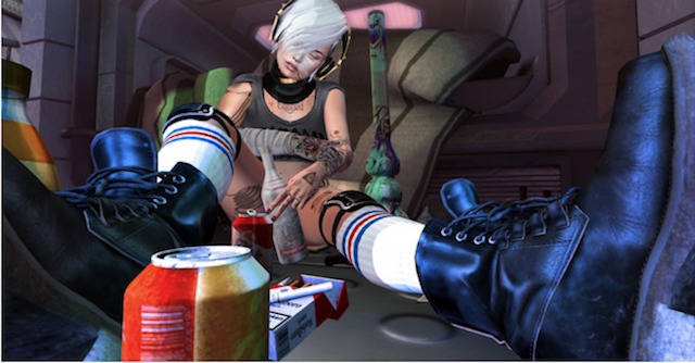
I like Time to Find a New Pastime by Flic Ulrik/Agent Orange. This picture gets its punch from the angle, the yoooooge boot. Then there’s the bottle in her hand while she dozes, a bong, drink cans and cigarettes. We can all imagine her headache in the morning for which many would recommend using natural supplements like cbg isolate.
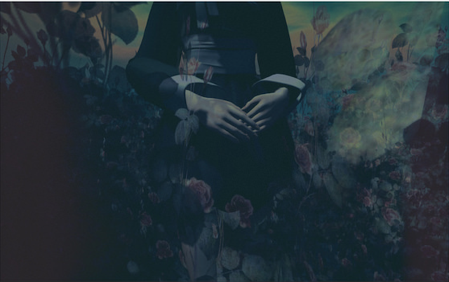
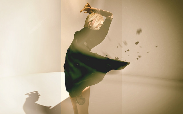
I like CCCXX | …appearing from the disappearance by cicada. While this may seem centered, it is not. Most of the body is to the left of the center while the hands are mostly to the right. There are overlays used to add depth and texture. While generally, you want the figure to be distinct in a picture, that’s a rule that you can break when you are sure of the effect you want. In this picture the figure and ground compete, but it works this time. In fact, it makes you look closer, with more scrutiny to find the details of the figure. By framing this with just the trunk of the subject there’s added mystery and ambiguity.
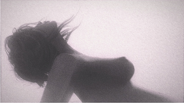
I like On the Beach by Fabs Burt. The grainy texture from a film style overlay gives this picture a naturalistic feeling. There is wonderful geometry in the composition, the lines made by her arms, her back, her stomach, the curves along her neck and breasts. The film-grain effect is so natural, I almost wondered if it was real life, but for the updraft needed to blow the hair upwards so close to the ground. It’s possible, but it would be uncomfortable.
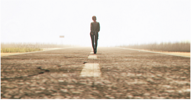
I like Untitled by Fanta Loon. I can’t decide if this feels like the beginning or the end of a movie. Is it sunrise or sunset? I guess since heroes ride or walk off into the sunset after they save the day, I will opt for the end of a movie. This a good example of leading lines, the lines on the road and the lines at the edge of the road, even the grass, all lead to the horizon. The blown out sky suggest infinite possibilities. She is centered and so is the horizon. Generally the rules of composition say avoid that, but it works here in part because there is not perfect symmetry.
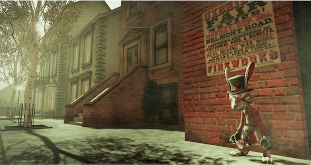
I like Time Waits for No One by Simon Sonnenblume. I like this one for it’s humor. That hare looks downright pugnacious. He is placed by the Rule of Fifths. The sidewalk and buildings form a line leading to a horizon out of the frame.
I like Life in the Wires by Io Bechir. This is a wonderfully geometric composition. Just look at all the truingles and lines. I also love the interplay of light and shadow.
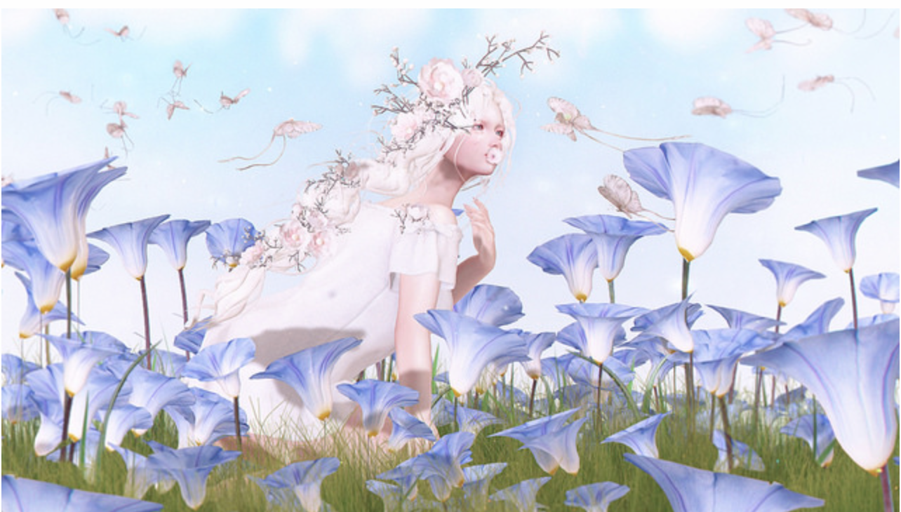
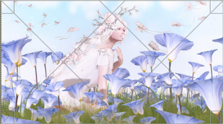 I like .00493 by Angelica Song. Here the subject is framed by the flowers. It’s a softly romantic picture. It is a great example of diagonal lines. Note how a 45° from the bottom corners intersect, how she is placed on that line on the left?
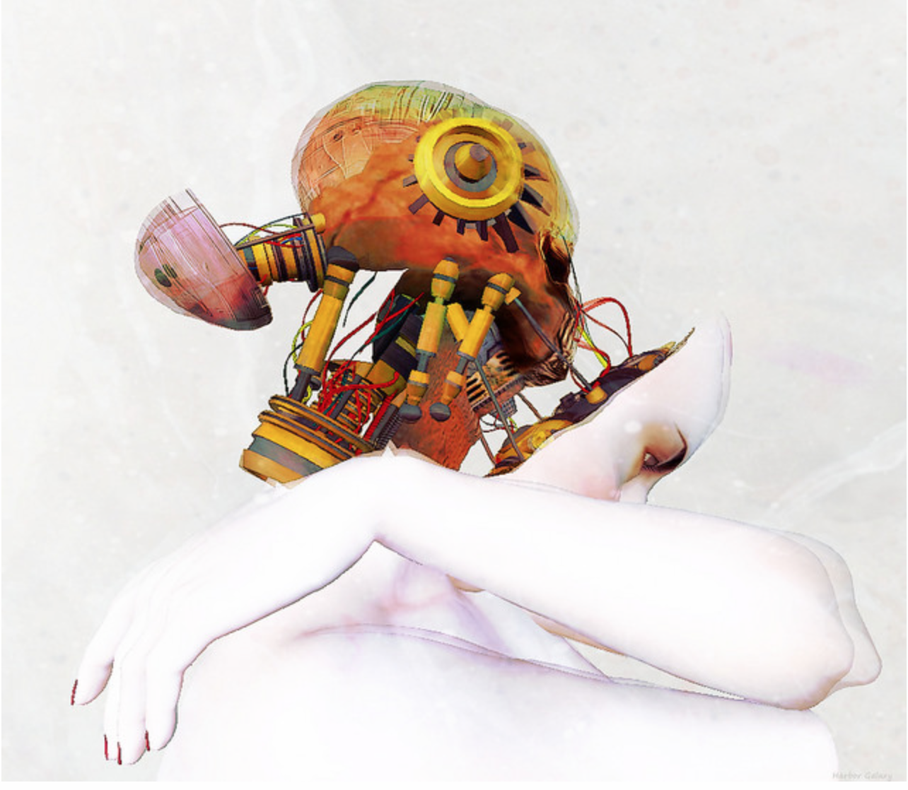
I like Interior by Deborah Lombardo. I just love this. I love the boldly colored brain and have no idea how it fit in the space provided. I love the contrast of color with all the white. It gives new meaning to the word head shot.
I like moondust by Brandon Taselian. I love blue light that suggests the moonlight and the bright whites where the light strikes his face and the deep, dark shadows. This is very much about depth of field. The background is hazy, moondust even. The figure is show in exquisite detail. Seriously, click through and magnify the picture, zoom in on the bands on his hair, the parts, the ring in his ear. The resolution of details is so sharp. This picture also illustrates how our eyes fool us. It seems as though he holds half the picture and then the other half is the background, but he actually crosses over. The absolute center of the picture is the inner corner of his eye, but because the way we perceive space, we put more weight on the right and on the bottom, it feels like it’s half and half.
I like ZigZag by Adalynne Romano. I am guessing you can see the diagonals and triangles all by yourself. What I love is the styling and pose that really takes advantage of all of it. The shoes tying together the top and the skirt, circles and chevrons, then the triangles. It’s just great styling augmented by a great background and pose to really come together.
I like Birthday Party by Pokute Burt. Sometimes it’s all about the angle. I love that this shot was taken through the skylight. We know who to look at, not just by where he stands, but because he is making eye contact with us and the other figure is looking at him.
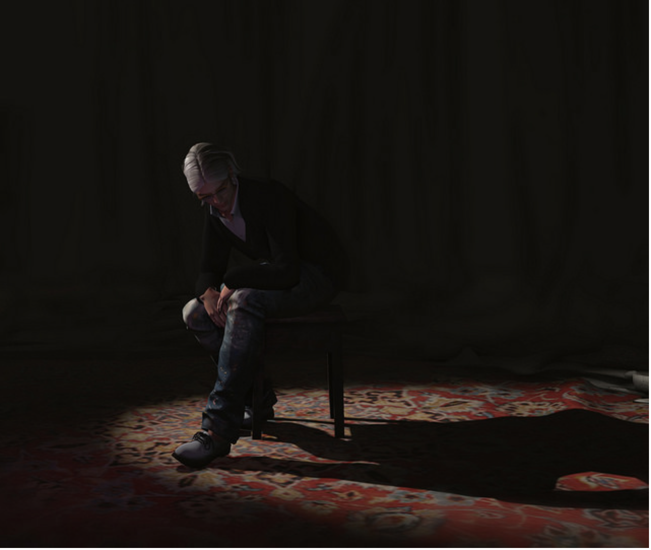
I like Send in the Clowns by SL Senna. This is composed using the Rule of Thirds. The emotional impact comes from heavy shadows, the faint illumination, and the pose, all conveying deep thought or even deep sorrow.
I like In a Bar by Gorba McMahon.Don’t yHere we have a frame within a frame, You can see the liquor dispensers make a diagonal frame to his left and right, a diagonal he echoes with his body. He and the sunlight are framed by the dispensers.
I like Q/Quincy/Client Commission by Lalamoon. I just love this picture. It seems like something out of a celebrity gossip magazine with the bold colors, the high contrast. It’s just so fresh and original for Second Life photos and some of that comes from her process which begins with an SL screenshot but is also rendered in Brush. The subject of this photo blogged about the process.
I like Love by Ʀƴǫ.. ? ? cнαт ɴᴏɪʀ ? This is a fun, story telling picture that just makes me smile. I like how they are framed by their transportation, the bike and the car.
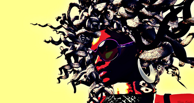
I like Modern Medusa by Chioma. This posterized photo is bold, graphic and has tremendous visual punch. Limiting the colors to yellow and red, two of the three primary colors adds to its simple power.
I like Vase by Kate Bergdorf. This feels like a painting, the soft light illuminating the vase and the open window, the texture layer giving it depth.
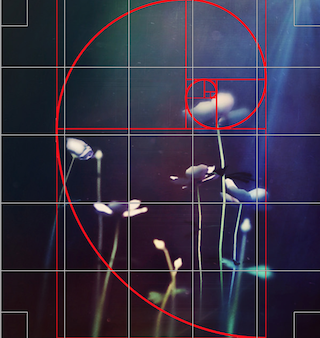 I like I Dreamed of Flowers Dancing to the Moon by Sunset Theas. This seems so very simple, but look how one fifth of the picture on left and right functions almost as a frame, then that brightest lit flower is placed by the Golden Ratio. Then there is the simplicity of using depth of field to blur so much of the stems and leaves. Note too that the clearest, most focused flower is placed by the Rule of Fifths. I think it is this subtle, subconscious balance that gives this picture such a feeling of peace and tranquility.
I like Restricted Freedoms by Hopa Shinobu. I love the feeling of movement that comes from her moving into the frame. There is, too, a feeling of uncertainty, there is that curb, after all. IT might be, too, from this odd thing about how we perceive speed in pictures. In the book, Art and Visual Perception. Dr. Rudolf Arnheim wrote that in the West, “Since a picture is ‘read’ from left to right, pictorial movement toward the right is perceived as being easier, requiring less effort. If, on the contrary, we see a rider traverse the picture from right to left, he seems to be overcoming more resistance, to be investing more effort, and therefore to be going more slowly.” Of course, where people read from right to left, the effect would be just the opposite.
I like LEA AiR Land Grant Application Round Thirteen by Eupalinos Ugajin. This proves that if you have an aesthetic sensibility, anything can be art even a simple prim. Using a frame and texture layers, the simple prim has been elevated to iconography.


