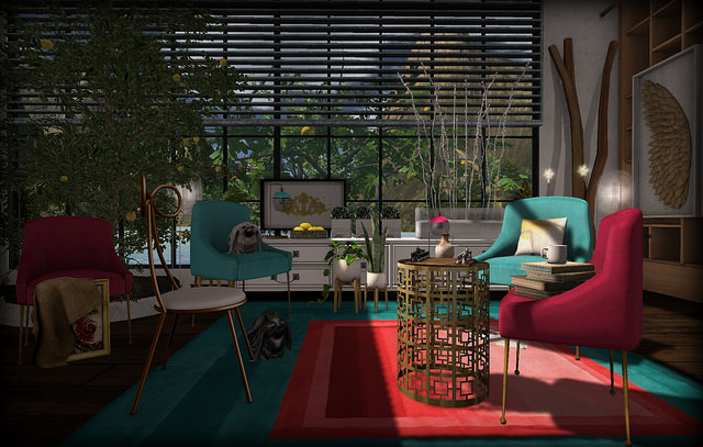
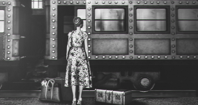
 Station Approach by Lily Lovelace.
I like Station Approach by Lily Lovelace. This seems like beginning of one of those old black and white movies. Everything is of that time and place, the vintage cut of the dress, the floral fabric, the stack heels, her hair style, the suitcases, and the train. Black and white only adds to that vintage feeling. Do you think she might be going home for a holiday? The floral dress suggest happy anticipation. There’s a present tucked into her tote, the only modern looking element. Of course, if it were a movie, someone would disappear from the train and she would solve the murder before arrival…without even mussing her hair. Meanwhile, the composition places her exactly by the rule of fifths. The bottom of the train car is also two-fifths from the bottom, a sort of horizon.
I like Kalimantan by Key Monk. This is another picture composed by the Rule of Fifths. The boat is three-fifths from the left and the horizon is two-fifths from the bottom. I love all his pictures, but this one has an additional element of whimsy created by placing the picture in a book. I also like that Monk credits the person who created the overlay he uses to give it an aged feeling. Please look at his entire photstream. He makes a mail caddy an object of beauty, reveals a build in a new light, creates mystery on a street corner, and makes the mundane extraordinary.
 I like Suit up by Myf McMahon. I think this might be one of the happiest pictures I have ever seen. Of course, that might be because I love the water in first and Second Life. The sun on the water is so inviting and it forms a diagonal line that runs counter tot he slightly upward line of the floats. But look how the top of the one on the left kisses the horizontal center line while the float on the right touches it at the bottom. Corner to corner diagonal lines show they are placed in exact counterbalance. The center float is not right square on the exact center which is a good thing. That keeps it more dynamic, retaining the feel ing of movement. Dead center would be, well…dead.I also love the social commentary, the women are nude, the man fully clothes in a formal suit. It looks just like an ad for alcohol or a Bond film.
 My Heart is Not a Can by Annyzinh Photos
 I like My Heart is Not a Can by Annyzinh Photos. As you can see, she is using the Golden Mean, consciously or unconsciously. I also love the way she creates energy with the pose and the way she made used the moon flask that is part of the outfit as a moon. Inventive and very kinetic with energy.
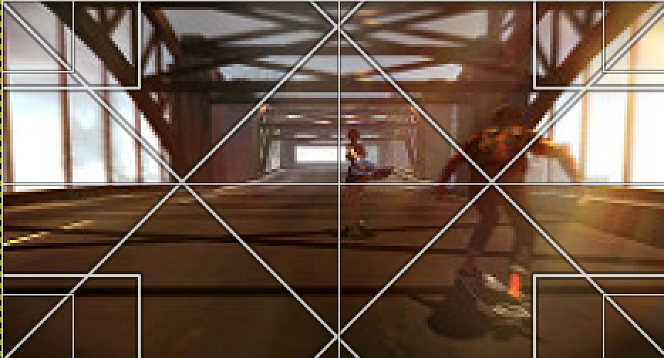 I like Untitled by Vidimus. I love this picture for the story it tells, the energy added by the subtle blurring, the bit of light created by a light leak overlay. It’s dynamic. They are both on skateboards, she is just off center, he is at the intersection of 45° angle diagonal lines from the corners…a way of cropping that suggests movement.
 I like Vahevala by DOWNBOY. I love the mood of this picture. In a way it violates the general rule that you have the subject moving into the frame (as in the picture above) rather than out of the frame, but in breaking that “rule” we suddenly get this sense of adventure into the unknown beyond where “there be dragons.” His picture is wide but not very high and does not follow the rule of thirds or fifths, but if you scale the golden mean to its dimensions, there you go.
 The Window of My Kingdom by Pepa Cometa
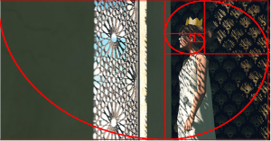 I like The Window of My Kingdom by Pepa Cometa. This is one of those “Wow!” pictures for me. She uses the Golden Ratio to place her subject and the window begins at one-third of the way from the left. I love that this queen is wearing a very plain shift that not only shows the extraordinary shadows, but also suggests the simple shifts of a captive, a prisoner, though one in a very fancy cage, looking out to freedom that is barred, the bars not only on the window, but imprinted on her face, her arms, and her dress by the shadows. She may have a crown, but it does not free her.
 Eternal Clockmaker by Dame Edith and Wilmur.
I like Eternal Clockmaker by Dame Edith and Wilmur. So I just love clocks in the first place. Strangely not in my first life, I have to look at my microwave or my kindle to know the time because I have no clocks nor watches. I stop watches. But in SL, I have so many clocks, I love them, mainly because I can’t hear them. So this appeals to me on the collector of SL clock level. More importantly, I love this for the story-telling aspect. I want to know this story. It feels like an illustration for a children’s story that will be whimsical and enchanting, just like this picture.
I like We Both Know by Sorcha Tyles. I love photos that look like they were taken on impulse. Slice of life photos that, despite the likelihood that a lot of work and planning when into the execution, give the impression the shooter just snapped the picture on a whim while wandering around living their life. That’s this picture, it captures that happenstance feeling that is rare in SL photos.
 Clientwork: Bellamy by Kiana Jarman.
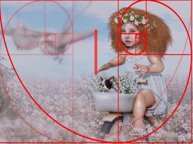 I like Clientwork: Bellamy by Kiana Jarman. So this is adorable. This is another example of the Golden Mean composition. Her face lays right in the sweet spot. One reason this succeeds so well as that her eyes lead right to the birds which complement her in a couple of ways. Look what happens when you flip the golden ratio? Then notice how the tip of the dove’s wing to the tip of her finger is a straight line. They stay in their own space. She is vibrant, sharp, completely in focus, the doves are soft, blurred, and subdued in color. It’s lovely.
I like Charleston by ByrneDarkly Cazalet. I don’t have to “understand” a picture to like it. I have no idea why she has a ship on her head or a pipe in her mouth…it’s not the source of the bubbles. I have no idea why it is called Charleston, other than Charleston was the port through which the majority of kidnapped slaves were trafficked and they came in on ships similar to the one on her head. Not sure that was what she was thinking of. One of the things that draws me to this photo is the swath of bubbles. The subdued color scheme is another. It just strikes me as whimsical and I really do not have to understand it.
I like Cool Shade by Augusta Rodent. This pictures appeal comes from the use of complementary colors and the light. Interestingly the light is brightest where the sweet spot of the golden ratio lies. It’s bold, colorful, and I want that room in my house.


