


Turn the Page by Nevereux
I like Turn the Page by Nevereux. Page-turning is common enough that there are dozens of “Page Curl Effect” tutorials on the internet. What I like about this is the idea of turning from black and white to color and even more the use of a person to turn the page. The pose is active and dynamic, as though there was effort involved in turn the page. This was a great concept and brilliantly executed.

Run. Rest. Respect from Kazicle
I like Run. Rest. Respect from Kazicle. I love how the shot is framed, from below, maximizing the contrasting angles of the wall and the runner. It makes it seem so much faster. The blue tones give it a noir sensibility that implies danger. The downward angle of the background is also ominous because downward trending lines tend to make us pessimistic.

People of Furillen by Erika Xaron
I like People of Furillen by Erika Xaron. This is perfectly composed by the rule of fifths. The right side of each chair abuts a vertical fifth and the subject’s left leg intersects the vertical fifth. The horizon is exactly two-fifths from the bottom. It’s so linear, the horizon, the beach, the chairs, the subject. It’s desaturated so we are not distracted by color from the absolute linearity of the picture.

Achieving Balance by “Ephemeral” Skye Nefekalum (Azram Belwraith in SL)
I like Achieving Balance by “Ephemeral” Skye Nefekalum (Azram Belwraith in SL). The general rule is you should avoid centering your subject, but note that the center of gravity is weighted to the left by the subject’s pose. What really pleases me, though, is the way the feet are positioned, one foot flat, the other pointed down, one on the wood, the other stepping down and forward. It takes us off balance and makes the picture more dynamic and intriguing.

Untitled by Shimmer Trenkins
I like Untitled by Shimmer Trenkins. This is one of those rare joyful photos. I love that her avatar is nonconventional and brash. This is another example of appearing to center the subject but keeping the picture dynamic by subtly uncentering the subject. Note that her lower half is all mostly on the left and her head is to the right of the center line. The other thing to note is the tree’s behind her lean the opposite way she leans. I also love how the sky follows the same color scheme as the subject, a sky-blue pink above with yellow below.

Smile by Huckleberry Hax
I like Smile by Huckleberry Hax. I love the way this is framed and the angle from which it is shot. His eye is at the exact intersection of one-third from the left and one-third from the top. He is the focus and is framed by all this geometry. This is a bold picture with strong colors, lines and angles.

wandering_world462 by Nekonuko Nakamori
I like wandering_world462 by Nekonuko Nakamori. The horizon is placed by the rule of 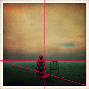 thirds. I like the aged feeling, the vintage colors and the old photo framed margin. There is hidden geometry, subtle shifts that unbalance the picture, making it more dynamic. Because the chair with the subject is “heavier” than the empty chair, we get the feeling the chairs are centered when they are not. They feel more to the left than they are if you actually bisect the picture. The direction of the triangles, to the left and upward also add to that impression. Because she is looking away, we get the feeling of aloneness.

Criss Cross by Miaa Rebane
I like Criss Cross by Miaa Rebane. First, this photo is effective at achieving its purpose, highlighting these shoes from Shoetopia. I also like its bold colors and simplicity. Here’s the real magic though, you know she’s looking right at you, right at the camera, and her eyes are not even in the picture.
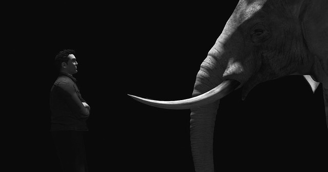
Elephant in the Room by moonedenbaum
I like Elephant in the Room by moonedenbaum.  I love the chiaroscuro light and dark, the way the subjects confront each other, their eye contact. You can see that the rule of fifths is being used. I just love how bold this is. I love that so much is in shadow, that we are participants in the photo, completing what we cannot see. It tells us a story, a moment in a story, we don’t know what came before or what will come next, but we want to guess.
One thing to remember with all of these pictures is that we cannot know whether the artist measured and thought out the way the picture is cropped. The rule of thirds and fifth, the golden ratio, all of these “rules” of composition come from the recognition over time that certain things look “right” to us and appeal to us. So, even without knowing the rule of fifths, when cropping a picture people often just know what looks “right” without conscious choice. It is in our nature to think this looks better than something framed differently.