 I like A Short Film About Long Things by Whiskey Monday. It defies gravity and our expectations. I also think it sold more HPMD grass than all their marketing combined. It’s a play on perspective challenging our expectations which is what art should do. Ernst Gombrich said, “Art is an institution to which we turn when we want to feel a shock of surprise. We feel this want because we sense that it is good for us once in a while to receive a healthy jolt. Otherwise we would so easily get stuck in a rut and could no longer adapt to the new demands that life is apt to make on us. The biological function of art, in other words, is that of a rehearsal, a training in mental gymnastics which increases our tolerance of the unexpected.”
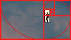
Well, that’s what Whiskey is doing, increasing our tolerance of the unexpected. In terms of composition, you can see the light pole follows the Rule of Fifths, the line from Whiskey to the bird and the edge of the grass follows the Rule of Thirds, and the subject follows the Golden Ratio.
I like When I Was Six Years Old by Chel Glitter. Here is a delightful story-telling photo from Chel Glitter. I enjoy her photostream for all the stories she gives us in story. This one just made me grin…but you should click through for the whole story.
I like Beach Fun by Emery/Teagan Parker. I love pictures that tell stories. This one is fun and every person is moving, jumping, reaching for the ball. All eyes are on the ball. Then look, too at how they form a triangle, and how the lines all angle toward the girl in purple. It’s a delight.
I like Lover of War 11-18th April 1966 by Zib Scaggs. I can pretty much count on Zib Scagg’s to produce bold, stylized photos that are black and white with a bold splash of color or colors. This is gorgeous, all about light, shadow, and form. Simple, minimal, and captivating.
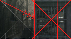
 I like Rainy Days and Mondays by Pixelbeing. I live in Oregon, so perhaps that’s why these dreary, cloudy, rainy day pictures always appeal to me. This picture is bisected at the center line, half the picture the building, the other half the outdoors. The fencing forms a leading line and 45° diagonals from the corners intersect at the center of the building. There is a person in the building…placed by the Rule of Thirds. I had a hard time choosing one of Pixelbeing’s photos. This is not particularly representative. There are many more pictures of people, pictures that are full of movement, of being right in the moment. Be sure to check them out.
I like No. 560 by Yuririkaze. This picture is shot from below, giving us a new perspective that make s it more exciting. The strong lines of the building also form a frame within the frame. The subject’s pose suggests movement, a kinetic contrast to the linear stability of the building.
I like Close your eyes and whisper your secret by Carissa Crimson. This is a fabulous picture that demonstrates you do not need to complicate anything to make a strong composition. First, consider the geometrics, the big circles, the strong lines on the floor. Then we have the baroque diagonal line formed by the subject and it is so appropriate that this optimistic, upward leading diagonal dominates this bright, happy photo.
I like Beach Day by Cassandra Middles. This is a good story-telling photo. What makes it catch my eye is the beautiful sunlight that blows out part of her shoulder and arm and brightens the sand castle. I also love that windlight setting with the luscious clouds.I like Massive Attack by Tutsy.Navarathna. Black and white often feels more artistic than color photos. That’s because it simplifies the image so we see forms, the shape of things, and are not distracted by other things. In this picture, it makes the circle of the ferris wheel into repeating circle of shapes without the yellow, reds, greens, and blues that would make them distinct from each other, for example. I love the use of depth of focus that makes the subject pop and the old photo overlay that adds age and a sense of time passing to the picture.
I like Curiouser and Curiouser by Gabriel. This picture takes complete advantage of CTL-8’s shift in perspective to create a fabulous rabbit hole.
 I like In Case I Don’t See You by Huckleberry Hax. This is just wonderful. I love how the stairs are scarcely visible. It is so simple, yet completely captivating and evocative. That door opens so many possibilities.
I like Sense of Space by Mochi/Vespertine. This is a lovely example of backlighting making a powerful picture where the forms and shapes are emphasized, the distractions erased in shadow. If this were in color, if the light came from the back, we would not be noticing the fine forms of the antlers, for example. They would be just one of many things to focus on, but with the backlighting, they are instead, a highlight.
I like Morning Symphony by Skye.The horizontal is easily divided in thirds–the top is exactly one-third of the picture. The bird, though, is placed by the Rule of Fifths. I love the bright whiteness of the bird in contrast to the grays and blacks of the background.
I like We Don’t Know Where We’re Going But We Know Where We Belong by Alicia Chenaux. I love the light, the delicacy of her pose, as though she is curtsying. There’s a lovely pastoral serenity in this photo that appeals to me.
I like When the Night Come by Bridget G. This photo drew me because of its beautifully realistic light. It just felt real. The decor is not overflowing with artfully placed stuff that would make living and moving a daily obstacle course. It’s simple and realistic.
I like “I don’t fancy colors of the face. I’m always attracted to colors of the brain.” by Yana. This begins as a straightforward headshot. She’s just the tiniest bit to the left of center, just enough to not make her seem static. A layer full of color was placed over the black and white, probably as a screen layer so the colors lightly sink into anywhere there is color. It makes a simple picture complex and even gives it purpose, illustrative of her message.
I like Man with Suitcase by Imani Nayar.This could be the cover of a book of espionage, couldn’t it. It’s a blurry, there’s a line on the street leading forward, but into what? A fog of nothingness, risk, danger, despair? How can we know? It’s all mystery, but it feels foreboding.
 I like Tell me when you hear my silence.. by Isabella.N. This reminds me of this water-color tinted old black and white photos. The subdued colors work to make it seem more an illustration than a photo, giving it a deliberate flatness that makes it feel like an illustration.
I like Sunset | Taken @ Furillen by Samanda Eddingham Jewell. The woman’s placement follows the Rule of Thirds, the land horizon follows the Rule of Fifths. This a gorgeous example of backlighting where the light itself becomes a focal point of the photo. This is emphasized by the arcs that radiate down, the bright light, the tree tops, the hills, all progressively darker.
 I like up, up and … by Leeleu Lemondrop. I love how there is so little color in the bottom two-fifths and an explosion of color chaos above. She is place by the Rule of Fifth which governs the composition, where her eyes intersect, the “horizon” where ground meets foliage, the division of little color and wild colors.
I like Order Up by Alexis Rose. This was so much fun, I shared it on plurk. I love its story-telling The way the dogs are avidly watching for a hot dog or burger to slip and fall. The way he in engrossed in telling some story and she is tuned out. It’s such a visual of mansplaining particularly with the beer poised to spill down her front.
 I like 【◎】ω・*)ゞ ? b ? by Yossuieel Eel. This is a good example of perspective. Her hand is out in the foreground. I just enjoy it so much as a bit of Girl Power. Her thumb is placed by the Rule of Fifths.
And for another set of great photos, Anya Ohmai plurked a few of her faves.


![beach day[shop live stream]](https://c1.staticflickr.com/5/4212/35140542695_88c4878463_z.jpg)


