I like Gelato by Michelle Halster. The ice cream cone is placed according to the Rule of Fifths and it is a focal point in this photo, however, its real intensity comes from the eye contact between the two of them, the way they hold each other’s hands. That sense of being in a world of their own is accentuated by the sky forming an arc around them.
I like <3 by ♥Talija♥. First I love forsythia, so this immediately drew my eye. I love the way she uses the flowers to make a frame within the frame, encircling her face.
I like Landscape Details 2 by Melusina Parkin. Parkin is known for her spare meditations on a theme, on fences, on windows, on chairs, whatever catches her attention. I don’t know how she finds these examples, but her spare, minimalist photos make me feel at peace.
I like Night Life by Nana. I am always drawn to photos that seem as though they were just shot on the fly, a slice-of-life snap that captures a moment in time. This is exactly that. Doesn’t it feel just as though she and some imaginary other person who took the shot were just walking down the street and the picture was taken on impulse? That’s hard to achieve in SL, but she does here. The blurred background is a big part of creating that sense of immediacy.
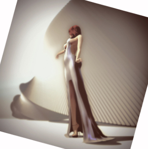 I like Transforming by Megan Prumier. This photo is all about the angles and curves and is just magical. We just naturally like geometry and with this we have beautiful diagonal lines. The lighting adds to the magic. If you straighten the picture, so the floor is level, the subject is placed dead center, but by tilting it on its axis…this becomes a much more interesting and dynamic picture. I also love the subtle color story, the light and shadows, but all subdued.
I like 2017.0430 by Iruki Levee. So first of all, she is so inventive in how she styles her avatar. A rifle-toting religeuse of some sort. The flowing chains with hooks on the ends. The color in the shadows. It’s just all very magical.
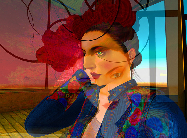
I like Dreams II by Jaopedro Oh. Jaopedro Oh likes to play with layers, laying them on top of each other to suggest the multitudes we all contain. I love the bold colors and the way it all suggests abstractions of the woman.
I like Infinite Ways by Callie Hamelin. This is a perfectly romantic photo that makes me think of Mary Cassatt and Renoir and the beautiful impressionist painters. SL’s Depth of Field is doing some of the work here. The wall forms our horizon and is placed by the rule of fifths, as are the cup and the bird, though the last two are not straight down the middle, they still intersect the line and balance each other. Another source of balance is the way the teacup and the rose and cluster of leaves all are proximate in size and form an isosceles triangle. You see the same the the bird, books, and shadow on the right.
I like Who hears music feels his solitude peopled at once by Cherise Abonwood. This is a striking image. The tree seems centered, though one-third is to the left of center and two-thirds to the right of the center line. Most of the detail of the landscape is lost, while the tree is nothing but detail. Then the layers placed over it. Two rectangular overlays, one in gray that is scarcely visible at first glance and then in red. They form a frame to the right and bleed to the left, their leftward weight countering the tree so it seems perfectly centered.
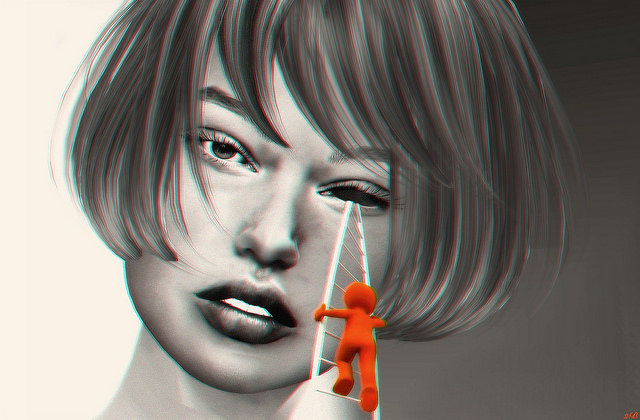
I like To Repair by ◀︎ 2B ▶︎. Haven’t we all felt like this. I remember the other day when the texture applier to my eyes just would not rez, I really wanted some fix. If I had only know there were technicians I could call. So, first of all the humor of this appeals to me, the contrast with the glamour headshot and the comic is delightful. I love the bold red in contrast to the desaturated photo.
I like I Will Fear No Evil by Madeline Zenfold. Such straightforward fashion photos are hard to make distinctive, but her choice of background, the lighting, the pose work together to make this photo draw my eye.
I like (…..d’un) Poisson Rouge 🙂 by Miu Miu Miu. I don’t have to understand a photo to like it. I have no idea why she seems to be blowing bubbles and a gold fish, but then I don’t care why. I just think it is fun. intriguing and delightful. Her composition follows the rule of fifths, the pipe one-fifth from the bottom, the goldfish one-fifth from the left and her face filling the right-hand fifth of the photo. Her creativity follows no rules but her own.
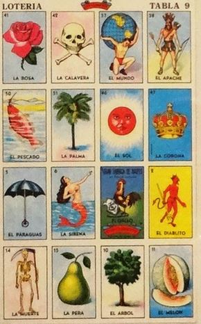 I like I Can’t Believe It’s May Already by Thea Highflyer910. First of all it reminds me of those lotería cards. The colors have those retro tones. It’s a fun, inviting landscape that is very stylized. If you watch Better Call Saul, the lighting in the Mexico scenes with Don Eladio are also very yellow with an emphasis on the lotería colors. In terms of composition, the flat land horizon before the mountains is placed by the rule of thirds, a third from the top. The sky meets the mountains one-fifth from the top, following the rule of fifths. There are five clusters of red, the horizontal one exactly centered on where a 45° diagonal from the top and bottom left would intersect.
 I like Call Me Maybe by Loverdag. So, Loverdag is incapable of framing a average photo. Everything she does is excellent so it’s hard to every pick one of her pictures but I like the visual simplicity of this one. It’s very spare, some sunflowers, a school bus shelter, power lines and trees against a beautiful blue sky. We have beautiful leading lines from the power lines and we have the sunflowers “looking” right at them.


