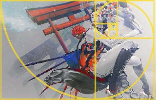
 I like 2017.0404 by Iruki Levee. Her control of color caught my eye first. There is the desaturated skin and background in shades of gray that make the bold reds, yellows, and blues pop. Then there is the beautiful free-form setting as though she is resting in a cloud, though clouds don’t show shadows (I’ve tried.) Then, the composition fully embraces the Fibonacci Spiral. It all comes together in an amazingly powerful photo.
I like #2 Lisan Lady in Black by Mafalda Diesel Aαlim. I like her use of complementary colors and the way she creates layers in front and behind the subject. It’s simple but effective and draws my eye with the bold choices she made.
I like Not a Word by Lea Oh. This is a powerful portrait and breaks the most common rule of composition: Place your subject off-center. The thing is, rules are meant to be broken when they can. So why does this work when most perfectly centered photos are inert? First, the subject is interesting and unique. Second, the background is clean. Third, she adds energy and disrupts symmetry with the diagonal line of her hair and the way her hands, one high, one curled low, echo that line.
I like We Are All Made of Stars by N. Redenblack. I just love the idea behind this. We have a silhouette, or perhaps a reverse silhouette as we see the stars through it rather than around it. I like how to pose fills the frame, the gradient blue sky, and of course the lovely concept of illustrating Carl Sagan’s beautiful words, “The cosmos is within us. We are made of star-stuff. We are a way for the universe to know itself.”
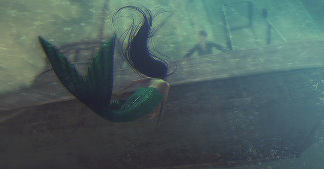
I like Overboard by Ziekling Bunnyhug. It tells a story, there is energy and movement. She is looking at him. He is looking at her. I like how we see from below, through the water that obscures him. The murkiness of it all seems right. I love the hair flowing in the water in curves that echo the tail.
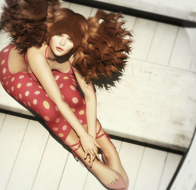
I like Life is What Happens When You Are Busy Making Other Plans by Taleah Mcmahon. This is just such a natural looking photo. Doesn’t it seem as though someone just said, “Hey, look up and snapped without planning, positioning, or even thinking about it? I love those photos who succeed in looking like a candid snap that happened spontaneously, even if I know that prop, pose, clothing, hair and all required all the planning and decision-making. Even when the her face is in the sweet spot of the Golden Ratio, when the artist makes all those decisions invisible, that’s magic.
I like Water Color by Anya Ohmai. I like the rich colors and the direct way the subject looks up at us, capturing our eyes. I like the way her hand reaches out to us and the perspective it creates. She creates a frame within a frame with the water lilies and the pollen. The details of how everything looks above and below the waterline are beautifully done. It’s a stunning photo.
I like KINJO longshirt by [sYs]. Speaking of a frame within a frame, her she frames the subject with a yellow triangle which is perfect because the top shirt creates a triangle, too. And it’s white is the same as the white brick, the lines of fabric pulling echoing the lines of the bricks. It is again, perfectly simple on the surface but revealing so much complexity when you take a moment to appreciate her decisions.I like t.t. by ☪ANDY who makes another frame within a frame, revealing the subject’s face through the tree branch and leaves. This creates three planes, the foreground, the subject, and the background. Depth of focus blurs both the foreground and background while the subject is sharp and clear despite the leaves in front. There is a fragility to this photo that I like a lot.
I like You Wish by Angelica Leiner.Here is another photo that is centered. Again, it works because the subject is powerful and intriguing and the background is clean. Also, while the subject is centered, there’s a bit of compositional thumb on the scales. The right side of the hat has more embellishment and only her right hand is visible. The left side of her face is in more shadow than the right. These add weight on the right side that add tension to the picture that would not be there if the symmetry were absolute.
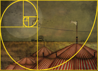
 I like Riding High by Morgana Nagorski. Not only is it whimsical and fun, with a vintage carnival appeal, but it is also beautifully composed. The horizon is placed by the Rule of Fifths, The big tent’s pole is one-fifth from the right side of the picture. There is a texture layer than gives it a varnished feeling, like an old print. and of course, it’s just fun.
I like Hoppy Easter from Tamarind Silverfall. It’s a fun, romantic spring picture in pastels. I like how the bunny is also looking at us, just like the subject. Notice, too, how the ground goes upward from left to right, something that adds an optimism to the mood. There’s an overlay that adds a bit of aging and texture to the picture. In writing, the Rule of Threes suggests that things in threes are more memorable, funnier, and more effective. It’s “life, liberty, and the pursuit of happiness.” What does the pursuit of happiness even mean? But, the right to life and liberty would sound incomplete, we need a third, even if it is some undefined ephemera. In composition, there is the Rule of Odds, and like the pursuit of happiness, they don’t all have to be fully fleshed out…and can even be partly off the page, but three things, even a partial third are better than two.
As always, there are far too many good photos that draw my eye. In fact, there are five pages of favorites since last week that I had to choose from. It’s so hard to limit my choices because there are so many pictures that I like.


![[sYs] KINJO longshirt](https://c1.staticflickr.com/3/2908/33073829784_d2e084f2c1_z.jpg)


