I like Wandering World 484 by Nekonuko. The bottom of the windows fall exactly 2/5ths from the bottom, but the real magic in this picture is its impressionist painterly feeling created with an overlay that adds texture as well as making the lighting more complex and richer. The color story is beautiful, too, with the yellows to balance the blues.
I like Untitled by Kiiko. I love the interplay of shadow and light. The Rules of Thirds is used in bounding the dark right edge and the placement of the subject. The green and red are complementary colors. It’s well-composed in framing, color, and lighting.
I like Untitled by Jammie Hill.  This is a great example of geometry making a picture powerful. The geometry is reinforced by the x crossed in the background. It’s very minimalistic which suits the subject and yet, underneath that simplicity is a complex arrangement of geometry
.
I like Naiad II by DeeDee Deepdene. I have long appreciated her skill with light and the way it filters through hair. This picture is a delight, not just because of the insouciance (I used that word for Dove.) of her pose but also because of the light, the way darker rocks frame her upper half and echo her pose, the way the splash of water does the same from below.
I like In My Virtual World by Snow Chocobo. I love how she creates three planes, the foreground, the subject in the middle, and the background. I love the brilliant light illuminating her shirt. She does so much with the light.
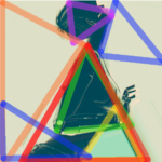
I like Untitled by The Friendly Otter. I love the geometry, the diagonal lines are everything. Generally speaking diagonal lines that go upwards from bottom right to upper left are supposed to be positive and optimistic, like economic growth. This does not feel optimistic. Part of that is the desaturated colors, the degraded details, and the overlay that adds diagonals in the opposite direction as highlight and shadow–as erasure. This gives it a lonely feeling, the very opposite of optimism.
I like Mémoires de tilleul by Tutsy Navarathna. This feels like a scene from a Hitchcock film doesn’t it? Even the overlay gives it the feeling of old film stock that has aged, had some light damage, or looking through a window at a man in the rain. There’s the sheen of rain on the street. The subject is placed by the rule of thirds. Generally, people are encouraged to have their subjects look into the frame, not out of the frame, but for this picture, looking out of the frame adds to the feeling of anomie, making it so much more noir.
I like Leave Your Hat On by <X…> Brilliant chiaroscuro photo. The subject is placed by the Rule of Fifths at the outer bounds of the picture. Most of the photo is negative space, The light is stunning, so bright it burns out some of the detail just as the shadow hides the rest.
I like Leprechaun by Kynne Lleellyn.I love the whimsical design. The subject and the horizon are placed by the rule of thirds, but does that matter when there is just so much joy?
I like Inhale by Fingers Scintilla. This is a great example of how someone using GIMP or Photoshop can use layers to take a simple headshot and make it a work of art. I like the effect of light and shadow and the brilliant, rich, saturated colors.
I like Ashemi12 by Blip Mumfuzz. This is another beautiful example of geometry , squares and triangles. The bold colors are stunning. And yes, this is Second Life, shot at the Azure Star sim.
I like Hipster Style by lamouettesurlepont. The subject is placed by the Golden Ratio. Here we see a strong sinister diagonal, giving us a sense of desolation. There are lots of triangle formed by the light that diagonally divides the picture. The duotone color scheme add to the mood.


Great choice, love them all.
Love this, I always find new people to follow!