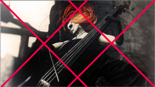
This is Let It Burn by Zibska. Sometimes pictures are made more evocative and powerful because of the angle.  Shot head-on, this photo would not be nearly so dynamic and it would not give us the shadow angles we have. See the dynamic angle that the neck of the instrument has, parallel to the framing diagonal lines and how that is echoed in the shadow. The subject fills the center and shot from below, she seems alive with movement All the energy in this picture, and there is a lot of energy comes from the angle. The fine black circular lines add to the kinetic energy, with the wild movement of the hair, there is a small whirlwind of motion captured. The bright explosive red is the only color and it’s placed directly at the top center. It’s a beautiful composition and is alive with energy.
El ático by Coqueta Georgia is artfully composed. She is placed so her face centers by the rule of thirds and her eyes by the rule of fifths. The bird looks at her, the flowers that frame the picture orient toward her on both the left and right. The red of the flowers are repeated in her lips. The yellow beak and black feathers of the bird are repeated in the yellow centers and dark leaves of the flowers. This is a beautifully composed photo.
This photo from Roquai is breathtaking. It’s called I’ll lead you down the rosy path…. The Rule of Fifths are at work here. The ‘horizon’ is placed by the rule of fifth, the subject is placed by the rule of fifth, In fact the subject fils the left 2/5th of the picture. The fox on the right is also placed by the rule of fifths and looks back at the subject. This picture is also a great example of light and shadow and the way shadows make what is illuminated so much more dramatic.
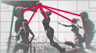
Jessica Nikita’s Change the Game; Don’t Let the Game Change You, is a great action shot. Of course, it’s Second Life, so it’s using poses and animations to suggest action. This is enhanced by using Depth of Field, bringing the ball which is contention into sharper focus and letting the rest blur. The rule of fifths is used to place the ‘horizon’, what seems to be the top of the wall of a circus tent in the background. Three players were also placed on fifths and one is dead center. The core element of the composition, though, is their gaze. All of them are looking at the ballad two of them, their arms are extending to the ball. It’s a great shot, desaturated, though with a hint of blue to suggest the light .
OMG! This is such a cute picture and beautifully done. Called Route 6, it’s by Hitogata. This relies on “leading lines” the use of lines to direct our eyes to the horizon. The end of the tunnel, where the light is brightest is one-third of the way down and centered, using center lines and the rule of thirds in placement. The lights form diagonals leading to the tunnel walls which then direct us forward. The bit of red light from the read is such a nice touch…flashes of color in an otherwise black and white photo.
I love pictures that tell a story and Isabella N’s “In Time” tells the story well. The Rule of Fifths rules here, the horizon, the man, and the woman are all on a fifth line. They look away from each other and by being placed to the side, one of them looks “into the frame” so the entire frame is part of what we perceive. That both of them are out of focus makes this a more interesting photo…nothing is in focus and that is how it is when people argue.
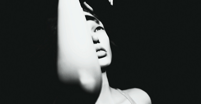
This brilliant portrait from Magic Marker is an excellent example of chiaroscuro, the use of uneven light to develop contrast and shadows. The subject is centered, in fact her mouth is dead center, but with her arm and the angle, she is weighted to the left, keeping her off center which is usually desirable. Pictures that are too balanced lack energy, so when you center things, you usually want to unbalance it somehow.
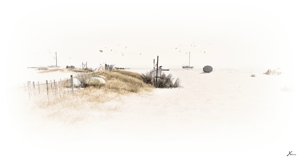
Day at the Beach by <X…> is a beautiful landscape gets its power by losing a lot of the details, burning them out with light. There are more than one way of creating this kind of photo. One way to do this is to create a gradient from white to transparent and overlay it but it requires practice and skill to do it this beautifully. I love that it is desaturated, blown out by the light. It makes the precision and sharpness of the remaining details so much more striking. It creates a mood and feels as much like a painting as a screenshot.
La vérité est au fond du puits by Jun Sagittaire is everything. It tells a story, it’s beautifully framed and it’s something new. In terms of framing the photo, the subject is the bottom of the well and is placed by the rule of thirds. That is what draws the eye of the man and the animals. It is a beautiful picture perfect for a fairy tale.
As ever, there are 10 or more pictures I like for every one I feature. so you can check out my Faves if you want to see some more great pictures.


![[sYs] PAULINE dress](https://c1.staticflickr.com/1/627/33344512566_5313a16269_z.jpg)


![[ change the game; don't let the game change you ]](https://c1.staticflickr.com/4/3884/32486945624_b71441a138_z.jpg)


