 Be sure to check out this column’s Gallery on Flickr. There are stunning pictures there; many who deserve very much to be highlighted in this column. Highlighting five is arbitrary, i know, but it is important that I set a limit or I could lose days writing each column. For me, this time, color seemed to be a recurring element in those I chose to highlight.
The idea for this column, or more accurately for its precursor What I Like at Shopping Cart Disco, came from the daily plurks of a former SL resident who left several years ago. Each day she would do a WTF plurk and share her critiques of SL photos. Sometimes feelings were hurt and she defended her plurks and advice to help people take better photos. It seemed to me that you could achieve the same ends by highlighting what people did right instead of focusing on what people did wrong. Why do I mention this?
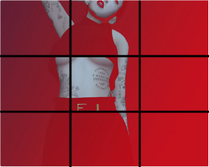
 One of her big complaints was people who shot pictures with backgrounds in a similar color to their clothing. She hated to see clothing disappear into the background. Well,, here is a photo from 나나 that proves that rather than disappearing, the similarity between background and dress intensifies our focus. After all, if we look closely, the skirt is clearly delineated. It is there, but we have to stop, focus and look for it. I love this picture. The subject is well off center, which makes for a more dynamic feeling. The close crop that requires us to interact with the picture, completing it in our minds also intensifies our attention. The bright scarlet red says STOP and demands we look. Everything about this picture says look at me and she knows it – hence the ironic title of the picture.
Of course, as a general rule, you do want the subject to stand out from the background, but those rules are not hard and fast and if you know what you are doing, you can break them with good, even stunning results.
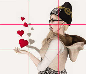
 Tamary’s photo is fun and whimsical. This is a good composition and she follows the rule of thirds to perfection.
What I really like, though, is the coherence of her clothing choices, her accessories, her hair and facial expression. They work together with the levitating hearts for a picture that is internally consistent and complete. There is not one false note. 
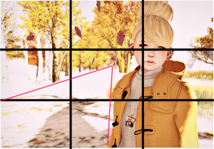
Untitled by Hironey Fairey
 This picture from Hinoney Fairey also has a background with similar colors to what she is wearing – though with a completely different effect. I love her bold use of color and how the details in the background are blown out by sunlight on snow. She also follows the Rule of Thirds and uses leading lines to draw our eyes.
Oakley Foxtrot’s photo of The Brew is one of those slice-of-life snaps that feel immediate, spontaneous and unconsidered – even though they may be anything but. The couple in the foreground give perspective to the picture and add to its energy and that sense of spontaneity – as though it were snapped on the fly without a second to capture them in the frame. The light leak adds color and light and elevates what may be an ordinary picture otherwise into something exciting and compelling.
May Coba’s run for the snow also follows the rule of thirds. The subject is moving across the frame and moving in the direction she’s facing which creates energy. The overlay that suggest windblown snow also creates a feeling of movement from left to right. I love how the the background is sepia and all the color comes from the bike cart and the outfit.
Don’t forget to check out the Gallery that accompanies this column where you can find my favorite 50. They are all from last week, holidays and migraines intervened between choosing the pictures and writing about them.


