 I doubt anyone would be surprised to learn that these columns are a lot of work. It is a good thing I enjoy them. One of the hardest parts about doing these columns is selecting just five pictures from my gallery and selecting only 50 for the gallery. That is the kind of abundance of worthy pictures are out there. Second Life® is rich in creative and talented people. That is its greatest asset. Be sure you check out this post’s gallery here.
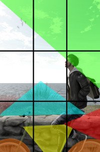
I Always Think About You by Nap (blissfulnap) is a delightful photo. It appears so simple, a young man pausing on his bike, watching some birds flying away. No special effect, so intricate props or set, just a pure and simple picture. At least that is what it seems. However, whether deliberately or unconsciously, Nap created a complex composition that exploits our innate need to find patterns and shapes. This is done so well that we cannot help but be drawn deeper into the picture, our eyes forced by his skill to see what he wants us to see. Our minds look for geometry; he gives us geometry.

When you really look at this picture, it is full of geometric shapes, and there are more than these very obvious ones. This does not mean that the artist sat down and drew out a plan for finding circles and triangles and squares. It can be the unconscious recognition that this position relative to the birds looks better than a foot back, that cropping the picture at this spot looks better than cropping it differently. Because these “rules” of composition are merely acknowledgement of what we naturally prefer, they do not have to be learned, we are born with them.
What they do, though, is intensify the wistful longing we feel when we follow his eyes to those birds flying away, as perhaps the person he always thinks of flew away as well.
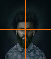
 Liisi Karfield’s portrait of Lucas 777 finds its power in symmetry. The stoic expression, the head on solidity of it all is reminiscent of American Gothic. Usually it is a good idea to avoid centering your pictures because that can make them static and lifeless. However, sometimes you do not want to have that kind of dynamic energy and instead what to reveal a singular element of your subject’s character – the implacable will, grief, vulnerability or their intimidating power – all can shine through. Then a straight head shot can work well. That singular focus on the eyes and the rest of the face, dropping everything else away can be powerful when done well – and this was done very well.
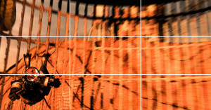
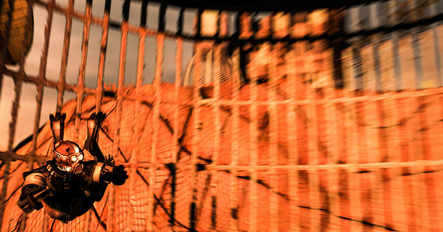
 Anti Gravity from Cypriss Hill is the polar opposite – and not just in color. It’s unbalanced and out of focus, the subject does not look out toward the viewer, instead looking out of the frame. For what? We don’t know, but we can feel the urgency. The blurred image is falling rapidly, faster than we can focus. While at first glance it appears that the Rule of Thirds has no role in this picture, a closer look reveals just the opposite. You can see the escarpment behind forms a sort of horizon at two-thirds from the bottom. You can also see that the subject’s eye fall exactly one-third from the bottom. Meanwhile, the subject behind to the left of the usual third from the edge placement adds to the sense of speed.
I love pictures that tell a story and this one from Rinka is sweetness itself. I also love this picture from Nap which gives us a different perspective. In this picture, the train track lead us into the horizon. This is a fine example of leading lines – a composition technique that guides our eyes through the picture. Why are these leading lines and not just a a track? Because it intersects the subject of the picture. It pulls our eyes to the subjects, not just to the horizon.
I decided to close with this excellent moody Hopper-esque photo from Len Douglas, Alone in Tokyo because it is another fine example of leading lines – though much more subtle ones. See if you can see the many lines drawing our eyes along the aisle of the train. One example is the bottom of the seats – all in a line going back drawing us from the front to the back and past the subject. Leading lines come in all sorts of ways, from railroad tracks to roads to bricks in the wall and seat benches. Some are obvious, some are subtle, but they all work to draw us in.
Of course, I love so much more than just the leading lines in this picture. I love its moodiness, the lighting, the narrative strength it has. It is a wonderful picture – one that shows just how rich we are in Second Life, thanks to the many artists who help us see our world anew.


Beautiful pictures!
Thanks!
being a layman not a professional, my eyes are drawn to the birds not by geomatry but the supjects head tilting up to gaze at the sky and as I follow his gaze I see what he is looking at. Photography is a hoppy of mine I am not a schooled professional, but I do figure out what I want people to feel when they look at my pictures. However, art can be perceived differently for each person, so I succeed in my endever by just getting anyone to fee at all when they look at my photographs. Sometimes people try to hard to figure out what the person meant when they created the art instead of just enjoying the piece.