 With Halloween coming, scary pictures are starting to take over Flickr and there are several in this week’s gallery of my favorites. They aren’t all scary though. There are also pictures celebrating the seasons of Second Life, the fashions, the quirkiness as well as some that are just slices of life.
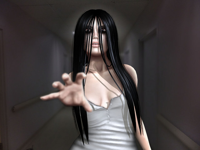
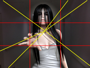 Candela Kira’s Kayako is inspired by Kayako Saeki from the movie Ju-On and The Grudge. I have not seen either one, but I assume they are terrifying as is this wonderfully scary picture. There is a lot of artistry at work making this such a scary picture. As you can see, she used the Rule of Thirds to put the focus on that outstretched hand. By centering her subject in the long hallway, the natural lines of the architecture create sight lines leading to her subject. She also used any eye control HUD to cross her eyes, giving them a spooky intensity. I don’t know if that hand is available in SL or a morph, but if it is a morph, it is the most successful one I have seen. It is out of focus, making its reach for you even more frightening because it adds depth and motion. This is a great photo that does exactly what she wants it to do. I was startled when it came on my stream – a small jolt of fear. What more can you ask for?
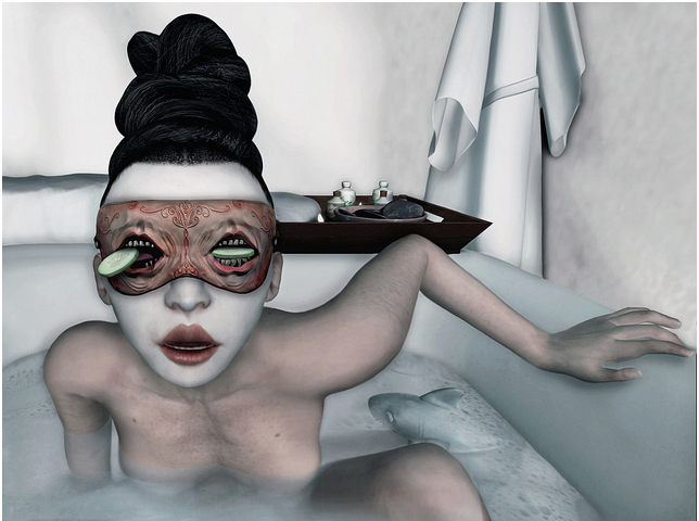
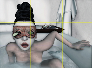 I get more creeped out by things with the eyes than just about anything, so this Lullaby picture from Del May sent my creep factor into overdrive. But as creepy as it is, it is an arresting photo. There are several things making it work. First, she used the Rule of Thirds to make the eyes the central focus. Notice, too, how the top of the towel behind her falls exactly on the horizontal third, creating a horizon. By the way, the mask and the cucumbers were put together by Del May. They were not even made by the same creators. The pose is integral to the power of this picture to capture our attention. That is more than fitting since Del May is a pose maker. Her mouth is open so that it similar to the mouths on the mask, making a triangular trio. Also the colors all have the same value which keeps our eyes on what she wants us to see, not on some pop of brightness that is out of place.
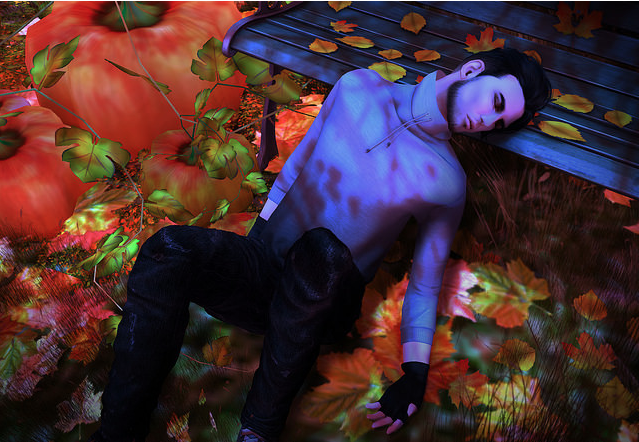
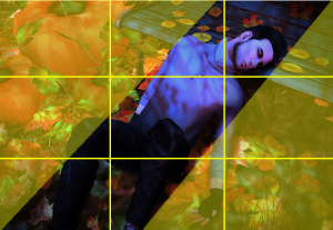 Le Plegua’s composition in this photo is stunning. The subject is framed by two triangles of colors that create a perfect triadic color scheme. These are colors that are equidistant on the color wheel and using them together usually produces a vibrant picture with strong contrast. As you can see in this picture, it works beautifully. The picture is vibrant, rich in color but still in harmony.
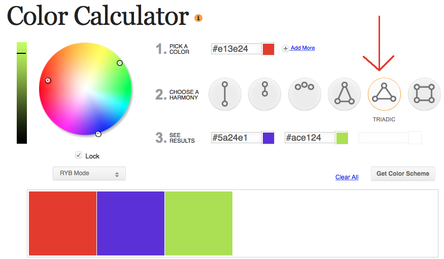
You can practice analyzing color schemes using Sessions College Color Calculator. I entering the Hex Code of the orange in this picture, I clicked Triadic to get the following scheme. What is cool about triadic schemes is that even with relatively pale colors, you still get an intense, vibrant feeling.
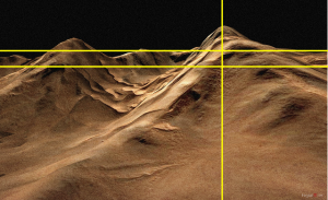 I am in love with this landscape from Morgana Nagorski. There is such stark beauty in its simplicity. The sky is a matte black without a ghost of a star or cloud, casting the sands of Ison into sharp relief. The lighting brilliantly reveals the complex ripples of wind-driven sand. It is so beautiful. And at first glance, you might think it does not conform at all to the rule of threes since the horizon is at 3/4ths of the way up. However, the highest peak and the one that dominates the picture crests at exactly 2/3rds of the way from the left.
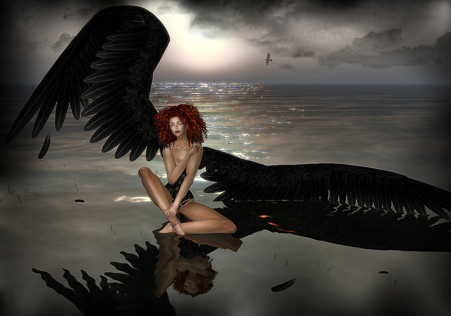
One Day I’ll Fly Away is a moving photo. The relatively monochromatic colors give it a somber mood. We don’t need to see her tears to know she is grieving. The grief is in the colors. I love that we see a bird flying in the distance – a visual reminder of her loss. However, the sun is breaking through, there are flashes of light on the water and she seems steadfast and strong. She will fly again, you know it.

