 In preparing these columns, there is always an embarrassment of riches. It is actually a difficult limiting my weekly gallery to only fifty pictures and it takes as long to choose five as it takes to write the entire column. Be sure to check out the gallery for many great works. There are some that are NSFW in case you have to look later.
 Vaki Zenovka appropriately named her homage to Patrick Nagel Homage. Nagel was a fashion illustrator who would strip away every non-essential element, leaving basic forms and solid blocks of color. It is a successful homage, true to the style of the original. It is also an excellent composition on its own. The Rule of Thirds is used in composition as a rough and ready approximation of the Golden Ratio. The Golden Ratio is a naturally occurring geometry found in the shell of the nautilus, in leaves and branches of plants and trees and even at the atomic scale. It is aesthetically pleasing and a powerful tool in composition.
 Whiskey Monday is back and as thought-provoking as ever. When I first saw this picture, I shuddered. Works of art are not always pretty or inspiring, sometimes they are painful and harrowing. This picture, frankly, is pretty creepy. It disturbs me at a visceral level. And you know, that’s what makes it so powerful. It makes us take notice because it’s so unusual. But it is also powerful because it’s well composed, using the rule of thirds to force our focus. We are also not distracted by any color or anything extraneous. We have to look…and not turn away.
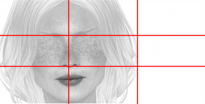
The last two pictures show us that sometimes showing only a little is effective and powerful. In Rakazi Villota’s “Windows to the Soul” everything is perfectly center. This works because he wants to portray power and intensity. The eyes are the focal point and the symmetry makes his face almost seem a human kaleidoscope. The eyes burn right off the page. It’s an amazing picture that works in large part because it is so dark. With too much symmetry, a picture will seem lifeless, but it is not perfect symmetry. There’s more light coming from the right and the chiaroscuro brings it to life.
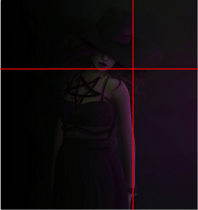
 Witching House by Crystal Cranberry is another picture with low lighting that forces us to look closely to see. However, all the details are visible. There’s just exactly enough light. The Light coming from the right lights her skin and you can see that this visual highlight of the picture is exactly two-thirds from the left. At first glance, you might think she has centered the subject, but the vital focal point still follows the rule of thirds.


![[what if I fall? - oh my darling, what if you fly?]](https://farm6.staticflickr.com/5611/15526438876_fdc8c3c1c8_z.jpg)

