 Migraines have been giving me trouble this week, but I woke up feeling pretty good today and hope I can finish this post before another headache comes rolling in. There are so many good pictures, it will be hard to choose just five, but there are more in the weekly It’s Only Art Gallery on Flickr.
Jewel Appletor’s Bridging the Gap is a Lilliputian masterpiece with the Noritaka Tatehana style heelless platforms augmenting her already outsized height. I love the detailed trees on the tiny outcroppings of land and the furious concentration on her face. It is a delightful and imaginative picture.
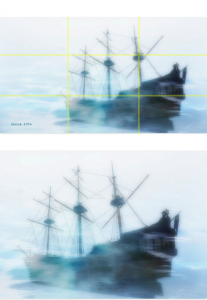
Ghost of a Memory by Becca Dillingham uses an overlay to create a feeling of foggy chill right at the edge of fog and rime. I also love that she linked the texture so you can see her process as she gives credit to the texture maker. That is emphasized by its monochromatic color palette, blue is a cool color and this feels absolutely frigid. She places the ship on the left two-thirds of the frame, leaving the entire left third open. The prow faces towards the left – moving into that empty space. If that empty space were not there, the ship would seem static with none of the movement and agency in the original – as you can see in this example on the left.
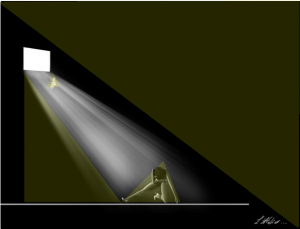
Window… by Sadbad Shan is a marvelously moody picture. I love chiaroscuro anyway, and this is so explicit with the light coming in so strong from the window. I love the unrealistic, but so satisfying straight white line drawn to create a floor – grounding the picture. The triangularization of the composition is powerful and makes this an incredibly stunning picture on many levels. We instinctively look for geometric shapes when we look at the environment and when we look at pictures. When they are used to frame a composition or as key elements in a composition it satisfies our senses. This picture with its whitest of whites and blackest of blacks is satisfying on multiple levels.
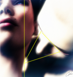
Nosferatu by Cipherscape is another picture where light and shadow work together beautifully. The soft focus gives this picture a tenderness and romanticism that Nosferatu probably does not deserve, but that seems to be how he operates. Cipherscape accentuates the tenderness with this close crop that focuses on her exposed neck anticipating that fatal kiss with her framing using the rule of thirds and the triangle.
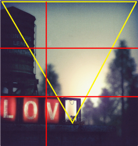 Love Nest by Mr. Godard is one of those “Is this really Second Life?” pictures. It really is. Mr. Godard excels at pictures that make you wonder, with uncanny verisimilitude. He uses the rule of threes to frame the picture, the top of the sign falling exactly one-third from the bottom and the tree on the left one-third from the left. The nest and bird are at the apex of an inverted triangle. Using depth of field, the sharp focus on the nest and the blurred trees remind you as clearly as the title that this picture is about life and love in that little nest.


I really enjoy these posts you do on SL photography where you analyze what makes your choices so successful as photographic art and the galleries you make in flickr to go along with the article.
Thanks so much. I enjoy doing these posts and it’s wonderful to hear people appreciate them.
WOW! Thank you so much Cajsa for the wonderful write up of my image, I feel blessed. 🙂 <3
You’re very welcome.Your picture gave me a lot of joy with its delightful humor. I want to read the children’s book it belongs in.
Cajsa, thank you very much for featuring one of my photos! I am so honored! And thank you for your wonderful description!
Thank you. You made me put my sweater on.
Thank you so much. I really was taking back by the attention and the write up. Much appreciated.