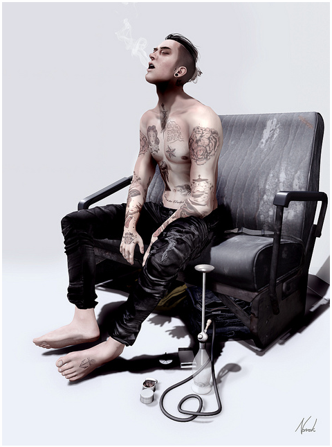
The Flickr® stream was full of many beautiful nudes this week as people were enjoying the smooth joints and supple curves of their new Venus from Belleza. I probably could have done an entire 50 picture gallery of just those shots, but there is the Belleza group for that. Instead, I looked for some storytelling pictures. As always, there’s a gallery of my favorite fifty of the week.
This picture from Nomak Nyoki is amazing with a verisimilitude that had me checking to see if it was really done in Second Life® and it was. The pose is completely natural and that puff of smoke is so perfectly done. The angle of the bench draws us toward the subject. Even though there’s no background other than white, the shadows ground the picture. It’s a stunning photo that with great simplicity tells a story, sets a mood and demonstrates exactly how much you can do in Second Life. There are not very many photos in his photo stream, but it is well worth your while to go check them out.
Mich Michabo’s picture is another that shows how simplicity can be very powerful in creating a mood and telling a story. She looks fearful, perhaps frightened by a noise outside her door. She’s peering through a break – perhaps a tear in some old-fashioned rollup blinds, a broken pane in the window. We see her from outside and the outside takes up the majority of the picture because it’s big and scary out there. She’s small, hidden and frightened. This is a very effective, very unnerving picture. That she makes it monochromatic intensifies the sense of unease and danger.
Bridget Genna’s picture is beautifully framed to take full advantage of the pose. Notice how her legs make an upright triangle while her torso and thigh make an inverted triangle. For some reason, we like geometric shapes in pictures and our eyes automatically find them. When we can turn pictures into geometry, we like them better and for some reason, according to researchers, we really like triangles. She is clever and crops the picture so that we become actively engaged in completing it, filling in the missing parts of their bodies – and that unconscious participation in completing the picture draws us into it and makes us like it more because we are interacting with it. The subjects are looking into the frame and their eyes direct ours where to go.
Worth a Wait by Sunny George is another geometry exercise with the curving wall and bench completed by the subject. I think the use of light and shadow is effective, suggesting a aura of mystery about him. Besides, he has all the hallmarks of the international man of mystery, a great coat, cigarettes and sunglasses.
Vallys Baxter’s Expression 190 is another evocative picture full of emotional subtext. Her face is in shadow, looking down, hands in her pockets, on knee bent, looking sad and contemplative. If we could not guess that she was feeling blue from her pose, there’s the lighting to reinforce that – making explicit what we can infer from her pose. I like the vignette overlay that frames the picture. It emphasizes the contrast between the bright white and the rich blacks. She follows the rule of thirds and the subject looks into the frame, drawing us into the picture.


