 Another week where it was a struggle to winnow my favorites down to only fifty, five of which I will feature in the column. The rest you can see here.
I love this picture. First, I am struck by the avatar, Jor.dan, who reminds me so much of Yolandi Visser of Die Antwoord. However striking an avatar may be, though, that alone cannot make a great picture. In this case, ARnnO PLAneR, who shot this picture, made several brilliant choices. First, he went for black and white which strips away distractions. Secondly, he broke the rules and posed her dead center looking straight ahead. Normally, a centered head shot can be dull, but there are exceptions and this is one. Notice how symmetrically she is posed, looking straight ahead – in this power pose with no expression other than that of intense focus. From that central focus – all the details fade away, her earrings blurred, her hair blurred. This strips away the distractions. This picture really is about that gaze, the unblinking gaze that looks right into you.
Eternal Prosperity is features another striking avatar who captures attention on her own, but this composite is also beautifully done. I like how the bokeh lighting connects the closeup and the body shot. Giselle Chauveau uses a bicolor overlay to create a duotone so the focus is on the form rather than the colors. She uses curves effectively with the curve of her arm making a lovely frame for the bright bokeh circle while dimmer bokeh circles curved on the left around her body, blending the two composites. It’s really a beautiful composition. You can see how much the duotone made this picture more powerful by comparing it to this earlier composite that is full color.
This picture from XxMistixX Melody demonstrates how little we actually need to begin telling a store. Here we have someone wearing boots, resting on a rifle out in the street and there is smoke on the street. No body, no face, nothing more – but there is an entire story here and we all get to complete it for ourselves.
Zib Scaggs made full use of the power of black and white to create drama. I love how powerful this is. I also love that on the black side, you can still see the details of the dress. Notice, too, that this is off-center, with slightly more black than white. It is stunning.
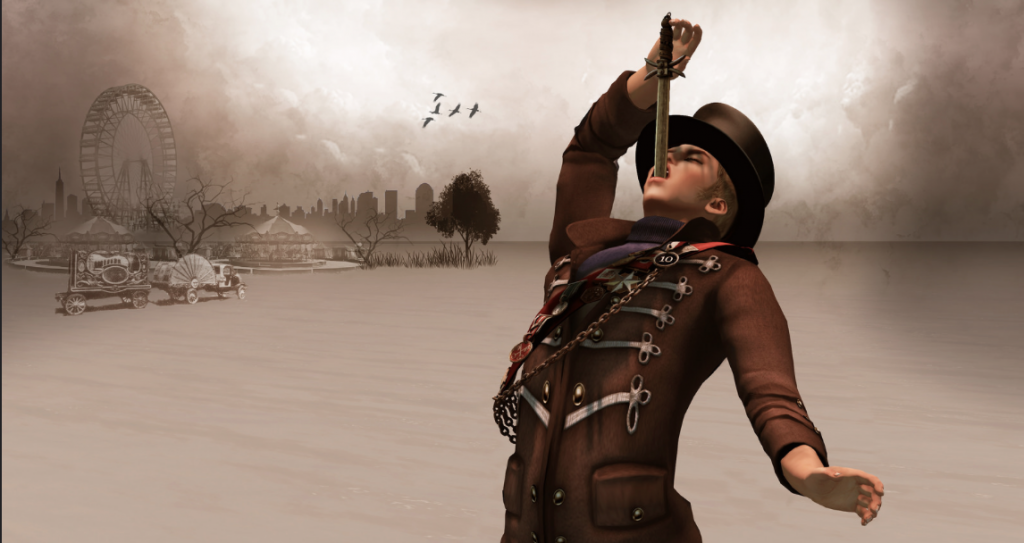
Spyder Silverfall’s The Sword Swallower is another story-telling picture though one that gives us more threat to weave our story with. What I like about this, in addition to the sword-swallower in such a perfect ringmaster’s costume, is that there is immense detail that does not overwhelm because the color palette is limited and subdued without losing any of its brights and darks. Truly a wonderful photo.


Spyder and ARnnO are two SL photographers who never cease to amaze me with their wonderful work. The other I don’t know but obviously are excellent too and I shall look further. 🙂
I so look forward to seeing this feature by you every week. You have brought images to us that we would otherwise have missed – and we would have been the poorer for that loss.
But to scroll down your choices of this week – so many amazing pictures -and suddenly come to one of mine…….and then another!
That my work is in the company of artists …. I wonder if they climbed in here whilst you were away doing something else!?
I am amazed, touched, thrilled, grateful . There only remains to say …….. thank you.